Art Blog #111: Basic Theory of Colors: Creating Harmonious Spaces in Modern Interiors
16. December, 2024 - Reading time 11 Min. - Peter von Hauerland
#TheoryOfColors #ColorTheory #ColorWheel #Harmony #CombiningColors #ColorTrends #InteriorColorTrends
Colors are at the heart of visual storytelling, a fundamental aspect of art, design, and culture. They influence emotions, set moods, and shape our perception of the world around us. Understanding the basic theory of colors is essential for creating visually appealing and functional spaces, especially when designing modern interiors. In this article, we’ll explore how colors are perceived and combined, delve into practical applications of color theory in interior design, and highlight the latest color trends to inspire your next project.
The Basics of Color Theory
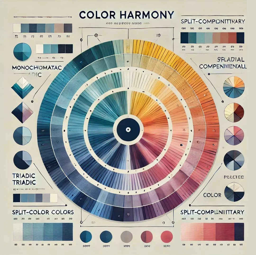
At its core, color theory revolves around the color wheel, a visual representation of primary, secondary, and tertiary colors. The principles of color perception and combination can be summarized through three basic rules:
The Color Wheel and Relationships:
Primary Colors: Red, blue, and yellow form the foundation of all other colors.
Secondary Colors: Green, orange, and purple are created by mixing two primary colors.
Tertiary Colors: These result from blending primary and secondary colors, offering nuanced shades.
Analogous Colors: Colors next to each other on the wheel create a harmonious, cohesive look.
Complementary Colors: Opposites on the wheel, such as blue and orange, provide bold contrast and visual interest.
Color Codes and Systems:
Digital and print design use precise color codes like RGB, CMYK, or HEX values to achieve consistency across media.
Interior design leverages tools like the NCS (Natural Color System) or Pantone’s Color of the Year to guide choices.
Color Harmony Rules:
Monochromatic Schemes: Variations of a single hue offer a sophisticated and minimalist approach.
Triadic Combinations: Three evenly spaced colors on the wheel ensure a vibrant, balanced effect.
Split-Complementary Schemes: These involve a base color and two adjacent complements, ideal for dynamic yet subtle pairings.
Applying Color Theory to Interiors
Color theory is invaluable when creating aesthetically pleasing interiors. By understanding how colors interact, you can design spaces that evoke specific moods, enhance functionality, and reflect personal style. In interiors, the choice of colors often incorporates color psychology and practical considerations:
Warm Colors (Red, Orange, Yellow): Energizing and welcoming, these are great for social spaces like living rooms and kitchens.
Cool Colors (Blue, Green, Purple): Calming and serene, ideal for bedrooms and study areas.
Neutral Colors (White, Gray, Beige): Timeless and versatile, they serve as a backdrop or balancing element.
5 Latest Interior Color Trends
Here are five trending color palettes shaping modern interiors and how to use them effectively:
Earthy Neutrals:
Inspired by nature, shades like terracotta, olive green, and taupe create a warm, grounding environment.
Example: Pair a sandy beige wall with clay-colored accents and wooden furniture for a cozy, organic feel.
Bold Jewel Tones:
Rich colors like emerald green, sapphire blue, and deep burgundy add drama and sophistication.
Example: Use an emerald green velvet sofa as a statement piece in an otherwise neutral room.
Soft Pastels:
Muted pinks, blues, and lavenders bring a gentle, whimsical charm.
Example: Pale pink walls with white and gold accents create a chic, feminine bedroom.
Deep Charcoal and Black Accents:
Dark hues are used sparingly to add contrast and modernity without overwhelming the space.
Example: Combine charcoal cabinets with brass fixtures in a contemporary kitchen.
Vibrant Retro Colors:
Bright oranges, yellows, and teals evoke a playful, mid-century modern aesthetic.
Example: Pair teal armchairs with mustard throw pillows in a retro-inspired living room.
Connecting Modern Design and Art
Modern interiors often draw inspiration from contemporary art and architecture. The interplay between abstract forms, geometric lines, and bold colors in paintings translates seamlessly into modern spaces:
Architectural Influence: Minimalist architecture with clean lines and open spaces complements abstract paintings and color-blocked interiors.
Color as Focal Point: A large, vibrant painting can serve as the centerpiece, setting the room’s color scheme.
Texture and Layers: Modern design integrates textures, such as metallic finishes or matte walls, to echo the dynamic layers seen in modern art.
By applying the principles of color theory and staying attuned to current trends, you can create interiors that are both functional and visually stunning. Whether inspired by earthy neutrals or bold jewel tones, the possibilities for self-expression and artistry through color are endless. Let your interiors become a canvas where modern design and timeless art converge.
End
MORE ART BLOG ARTICLES:
Art Blog #110: Art & Politics: A Historical Tapestry of Power and Resistance
Art Blog #109: Goals Are Dreams With a Deadline
Art Blog #108: No Room for Cringe: Embrace the Meme Life
Art Blog #107: Black Holes Suck — The Best Space T-Shirt You Can Get!
Art Blog #106: Top 7 Reasons to Exhibit Your Art Online in 2025
Art Blog #105: Somewhere, Something Incredible is Waiting to Be Known
Art Blog #104: How Space Exploration Inspires My Sculptures
Art Blog #103: An Artist's Transition from Acrylic to Digital Art and back
Art Blog #102: Contemporary Wall Art for Every Room
Art Blog #101: How to Tell Creative Inspiration from Distraction
Art Blog #100: Patience as a Superpower
Art Blog #99: 10 Tips for Gifts for Creative People
Art Blog #98: A Cosmic Exploration of Imagination
Art Blog #97: Google Gemini: The Rise of a Creative AI
Art Blog #96: Join our Art Community on Reddit!
Art Blog #95: The Sombrero Galaxy: How JWST Changed Our Perspective
Art Blog #94: The History of Memes: A Deep Dive into Internet Humor
Art Blog #93: T-Shirts on Creativity, Dreams and Inspiration: Wear Your Heart on Your Sleeve
Art Blog #92: Arthur C. Clarke and his HAL 9000: The Birth of AI in Science Fiction
Art Blog #91: Great Things Are Not Done by Impulse
Art Blog #90: Europa Clipper: Turning Science Fiction into Reality
Art Blog #89: When Art Hits Like a Movie: Painting Hollywood Iconic Scenes


